
Project Context
The RMIT UX Design Course gave me an opportunity to learn the fundamental UX design principles, frameworks and tools. Snapchat was the app that I have chosen for my design journey. Currently the app has changed its features, nonetheless, this case study was based on the old version.
My hunch
Snapchat is well known for its highly advanced lense feature, where users can take an AR photo or video through its app. Due to its ongoing release of new features and lenses, Snapchat has implemented an AR Bar, where users can access all those features.
However, this gave me a hunch that users struggle with navigating through the lense categories in the AR Bar, due the lack of information and unnecessary features at certain categories.
Date: August - September 2021
Methods & Tools
- User interviews
- Usability Testing
- Figma
Practices
- UX & UI Design
- User Research
- Wireframing
- Prototyping
Research: Supporting my hunch
Desk Research
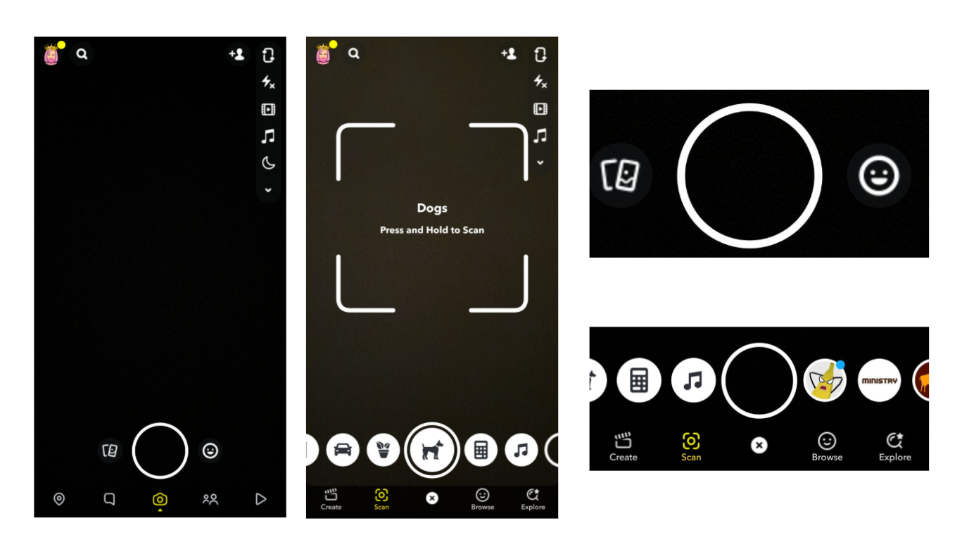
To support my hunch, I conducted a desk research to increase my understanding of the problem and uncover any generalised questions that I’ll validate with my users. Upon entering the app, you’ll notice that Snapchat is very simplistic with its design. To access all the lenses, also known as the AR Bar, we need to click on a smiley face. For first time users, it could generate confusion, as there is no indication of them knowing that this specific icon can lead you to all the lenses and features, unless it’s clicked.
Accessing the AR Bar will display a variety of lenses, with games on the left and AR lenses on the right. In the “Scan” category, Snapchat also adopts this pattern, with scans on the left and AR lenses on the right. Instructions for the scan are also very minimal with no clear direction on how each of them are performed.
Heuristic Review
One of Jakob Neilsen’s heuristic guidelines, consistency and standards, states that an application should never confuse a user, and they shouldn't have to ponder whether certain words, situation or action mean the same thing.
In Snapchat, the names for the AR Bar’s categories (Create, Browse and Explore) are vague and not distinguishable.
On the website, Snapchat offers users the ability to create their own lenses.
But by using “Create”, as a category, it can lead to assumptions that users can create their own lenses, as stated on the website. Except, in reality, this section contains more AR lenses with no relation to creating lenses, hence it doesn’t differ to the other categories “Browse” and “Explore”. The “Scan” category also loses its purpose as unnecessary features are added in that section, like more AR lenses.
Landscape Review
To further analyse the strengths and weaknesses of solutions currently in the market, I compared other competitors' apps with Snapchat.
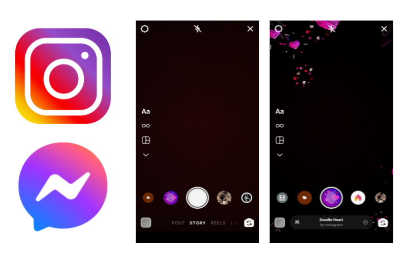
Instagram is one of the competitors that uses similar features as Snapchat. The lenses are organised by having all AR lenses on the right, whereas, any favourite lenses on the left. Information on the lense can be obtained at the bottom, which is easy for users to see. On the other hand, Snapchat hides the lense information on the top corner to preserve spacing on the screen. Other apps like messenger also have lenses, but with only basic scrolling.
Discovery: Understanding the issue
Who is the demographic for Snapchat?
After identifying the problem, I needed to conduct user research to help me explore the issue a bit further. Therefore, I needed to know who is Snapchat’s main target audience.
According to Smart Insight and World Stream, Snapchat appeals to the younger demographics. Its main target audience are mostly around 18-24 years old. Having this in mind, I created 2 personas that would guide me in my design process, as I could use them as a reference.
Each persona uses Snapchat differently, and both of them have their own pain points with the AR Bar.
My first persona, Hannah Gergech, likes using the lenses in Snapchat. She is a regular user, but is unable to find the lenses she likes because there are too many options and no solutions to narrow it down.

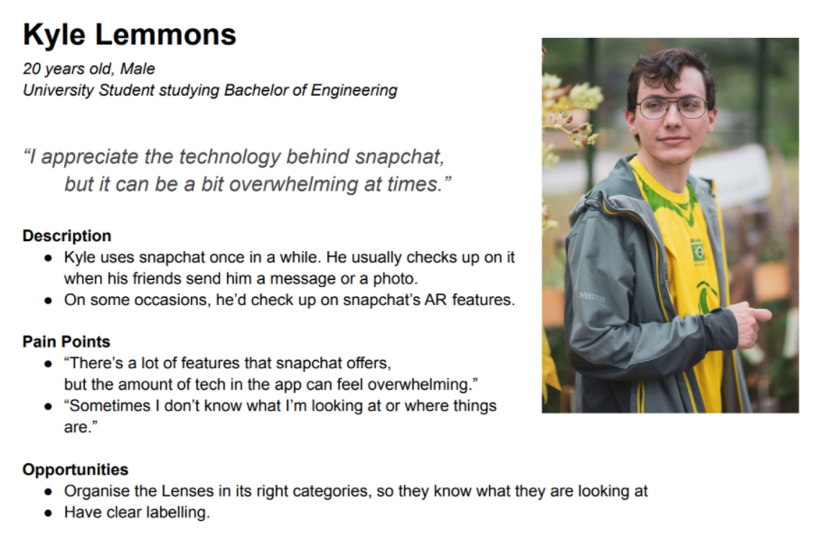
Kyle Lemmons, on the other hand, rarely uses snapchat. Only once in a while. He is the opposite of Hannah, where he feels Snapchat is a bit overwhelming with its features and is unable to use its full potential because of how cluttered it is.
Where should I go now?
With my personas set, I went to find users who are the target audience. My goal was to interview them, and understand whether they know about the categories and its purpose. Thus, 5 users were chosen, ages 21 to 24, and the interview was conducted through Zoom.
What do actual users think about the AR Bar? What were the findings?
While interviewing the users, I recorded their responses into Miro, where I grouped their responses into similar themes. Affinity Mapping allowed me to synthesis my findings and these were the main insights that I could gather.
Insights
- Users felt overwhelmed and confused when browsing through the lenses, because of the endless scrolling.
- All 5 Users didn’t realise there was a category section.
- Some felt frustrated, because they couldn’t find a certain lense that they liked.
How will I solve this problem using the gathered insights?
The key takeaway from these insights lead me to multiple recommendations and as a result, I came to these points.
Recommendations
- Users should be comfortable in browsing the lenses, while knowing what they are looking at.
- Without looking at the Icons, it should be readable and understandable.
- Ensure users are able to store the lenses that they like and be able to go back to it
Ideation Process
To generate multiple ideas and concepts, I adopted a few techniques to help me gain some perspective and suggestions.
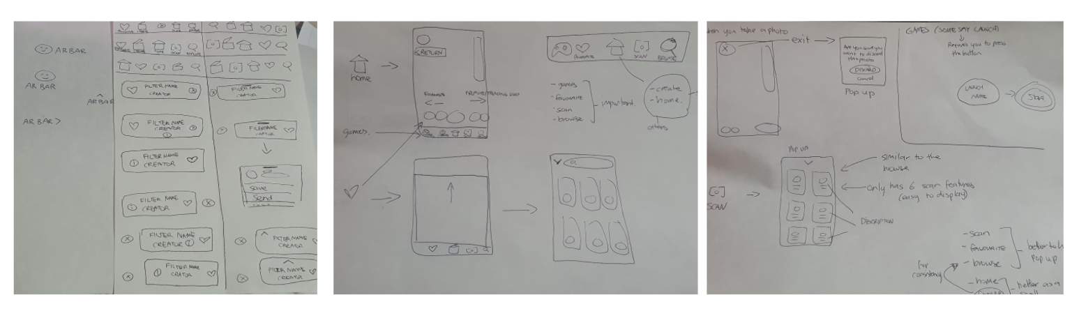
Storyboarding and Sketching
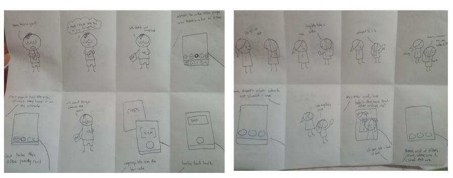
One of the techniques was storyboarding the personas. I needed to visualise the user’s process and their behaviour when they encounter a problem while using the app. Another technique was sketching out my ideas. I drew a variety of ways that I could present the icons, and because I needed to determine whether the positioning will disrupt the user flow, I needed some feedback.
A/B Testing
To receive feedback, I organised an A/B Testing, where two images are placed side-by-side. I asked the users, who were in the interview, which one they liked, or if they liked the original version.
The feedback that I collected helped me learn that although snapchat does a lot of endless scrolling, they still liked the idea of having real time feedback when scrolling. Some of them also liked the idea of a favourite section.
By asking the users opinion, I was able to get a general idea of the solution and the design.
Prioritisation
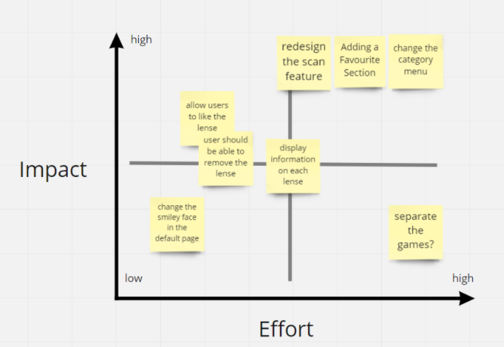
Through my ideation, I had a list of features that I would like to change and implement onto the app. In order to figure out which idea fits best in returning a good outcome to the problem. I needed to prioritise these ideas.
So one of the prioritising techniques that I chose was the Effort vs Impact diagram. This diagram priorities the features depending on the effort used and its impact on the user. The main areas in the app that would have a great impact on the users were the redesign for the scan and the favourites and category section. But this also means, it will require more effort.
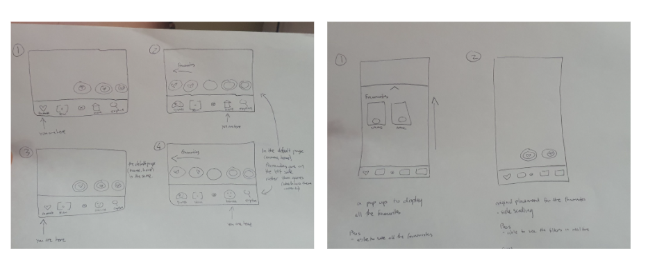
Low-fidelity wireframes
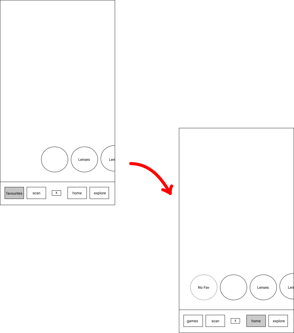
After the prioritisation, I proceeded with building a few low-fidelity wireframes. Using the feedback that I received, I replaced the “Create” category with a “Favourite” category. Another change was the “Scan” category, which only consists of the scan features. This is so that the section is true to its category name.
Most of my designs were inspired by Instagram, due to the fact that their layout was clear and concise. For instance, I brought the idea of having the lense details at the bottom, when accessing the lense individually, onto my wireframes.
The remaining category that did not require any changes was the “Explore” category, as there were no issues with the design so far.
Usability Testing
Obviously, I needed to conduct usability testing, so that the user flow for my wireframes are understandable. As expected, they suggested some changes.
Explore Page
- Some users felt that the explore page was “out of place”.
- They weren’t sure how to go back to its default page.
- Moreover, It felt like a separate section in Snapchat.
No Information Button
- There was no indicator of how to access the lense options/information.
- Hence, they wouldn’t know they needed to tap the name of the lense, in order to access those options/information.
Game Section
- Users all changed their minds on the favourite section. Originally, during the A/B Testing, I suggested if they wanted a games section or a favourite section. Due to majority votes, they liked the idea of a favourite section.
- However, with the flow of the wireframes, they found it extremely unnatural to have games in the default area.
- They also felt that favourites in the default page, will be quick and easy for them to access.
Redo: Low-fidelity wireframes
Using the key insights from the usability testing, I continued with redesigning the low-fidelity wireframes to suit the users needs.
Since users felt that the “Explore” category felt unnatural, my recommendation was to include all the categories at the bottom. By keeping it fixed down below, users can feel at ease and still be familiar with the “Explore” category.

As for the lense options/information, I recommended keeping an “i” icon to ensure users that options are accessible through this icon.

Finally, I converted the “Favourite” category to a “Games” category. While all the user’s favourite lenses are in the default page on the left. The reason for this was so users would be able to immediately access their favourite lenses without having to click an addition button. I also recommend having a heart icon on the corner of the favourite lense to help users verify that those lenses are liked.
With those changes, I revisited my users again to check whether the user flow was plausible. As a result, they were all satisfied.
Outcome
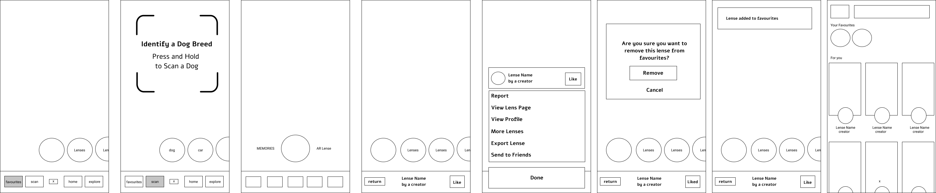
After the big approval, I finished it up with a mid-fidelity prototype in Figma. I added some icons to produce a semi-realistic Snapchat. Although this is just a mid-fidelity prototype, I included yellow to indicate which category was active for the users.
The prototype is indeed clickable, and it should allow users to navigate through the categories while accessing the features depending on its category. In conclusion, the design should be more clearer and accessible.
Final Prototype made in Figma
Reflection
Knowing what is good design
Through this course, I have learnt alot about UX Design. I realised that UX design emphasises the importance of communicating with the audience, and that good design isn’t always about building “pretty things”, but ensuring that anyone who uses the product or service comes out at the end of the day with a good experience.
Breaking out of my comfort zone
As a person who is shy and enjoys her alone time, the hardest thing for this course was conducting interviews and presenting my work. I found it tough to speak in general as I have a lack of confidence and the fear of saying the wrong things. But it turns out that it’s okay to make mistakes. Just like the design process, you iterate over and over again, till you reach satisfaction. A person is never born perfect, but they can be, by learning through their mistakes. So through this course, by practicing my lines and preparing for my interviews, I was able to overcome this hurdle.
Other Case Studies