Project Context
The RMIT UI Design Course gave me an opportunity to learn the UI design fundamentals, atomic design, component libraries, use of industry tools, screen design, accessibility, iteration and usability testing. Bruno’s Best Friend was a given design brief that required me to deliver a prototype that fits the client’s needs. This was my design process for the given brief.
Company’s Background
Bruno’s Best Friend is a location based dog walking website that allows dog owners to select walkers in their area and schedule them to walk their dogs.The UI goal for the company is to deliver an inviting and fresh UI Design that provide a platform for dog owners to book a walker anytime, while also giving them full control on their bookings.
Date: September - October 2021
Methods & Tools
- Moodboarding
- UI Flow
- Creating Components
- Usability Testing
- Figma
Practices
- UI Design
- Wireframing
- Prototyping
- Designing for accessibility
Moodboard

From the information given, Bruno's Best Friend gives off a friendly vibe. Their objective is to provide dog owners an application that is safe for them to book outdoor walks for their dogs. Hence, I envision Bruno’s Best Friend with going to a park with flowers spreading across the green fields. This resulted in a color palette of greens and yellows resembling the green fields. Due to the nature of the vibe, I wanted the aesthetic to feel soft and warm, so rounded buttons were preferred, as any hard edges could defeat its purpose.
I also wanted the layout to be simple and straight-forward, because many dog owners are already busy with their day to day life, and any actions required from the application should not add any additional pressure for them. So when selecting icons, I needed them to be uncomplicated and modern-like. San serif will definitely fit the theme, though a mixture of serif was also considered. Lastly, a logo was needed to reflect the company’s goals since this will be part of their brand.
UI Flow

After establishing the application’s concept through the moodboard, I also needed to design the UI flow relating to the user’s journey in the application. Upon entering the landing page, users should have the option to book on the spot. This is so that users can automatically perform an action without having to navigate through the menu bars.
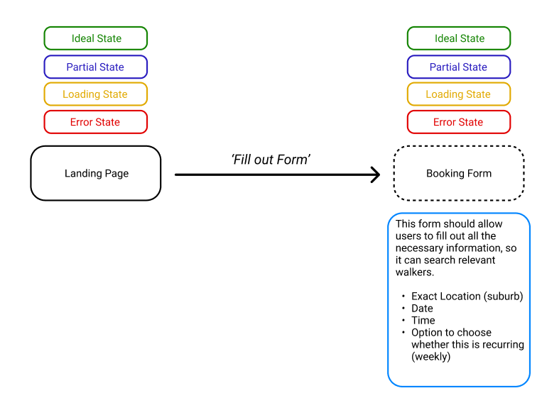
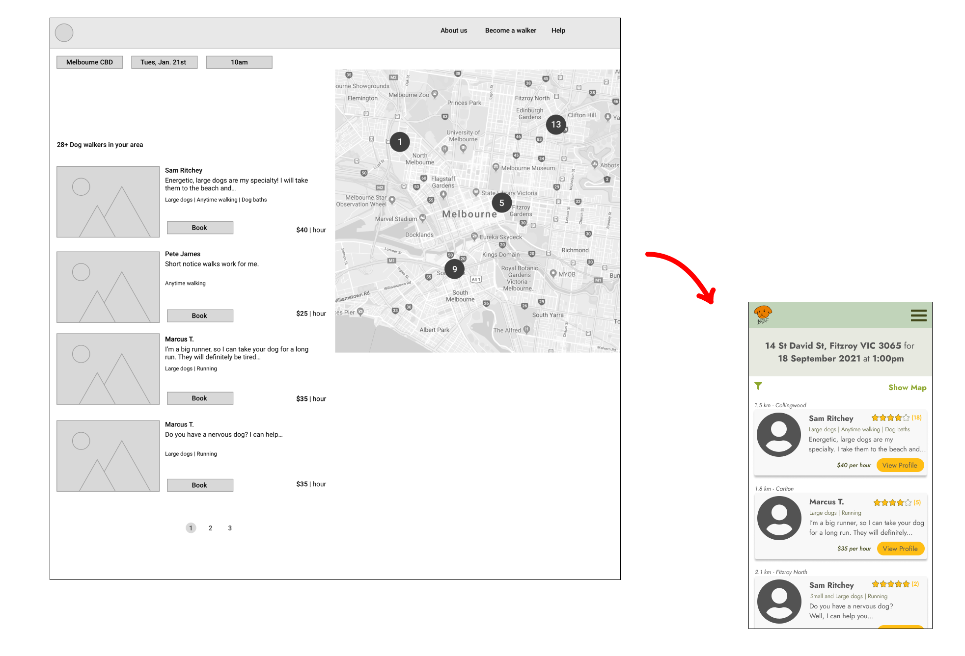
When they click on “Find Walker”, a list of walkers near that area should appear before them. Necessary information should be shown on the walker’s profile so users can decide which walker they want to book.
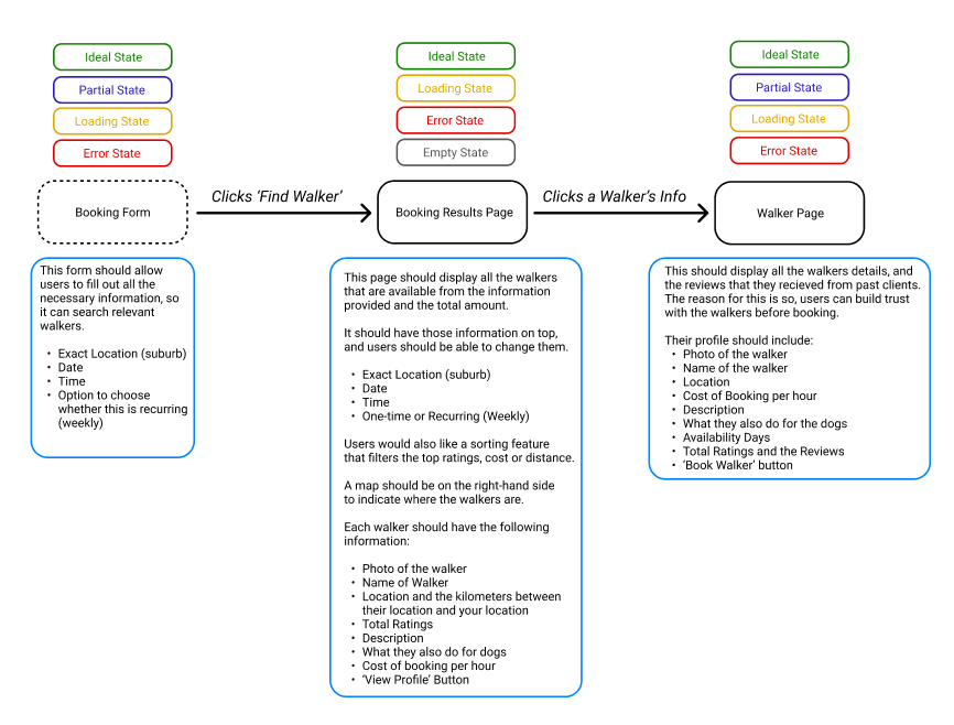
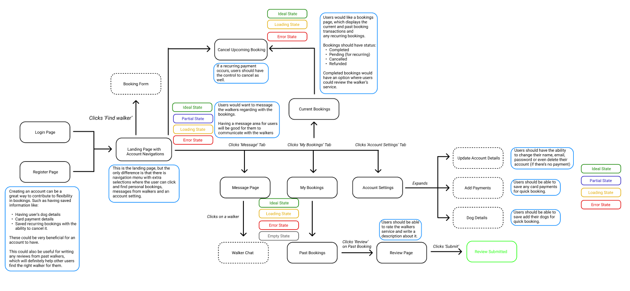
In the user testing insight, retrieved from the UX team, it mentions that the participants wanted a rating system where they are able to read reviews from other dog owners. Therefore, having an account is better for the user experience, because it could store all their booking history, where they could review any past bookings. Consequently, they could also manage any recurring bookings, message walkers and update their personal details.
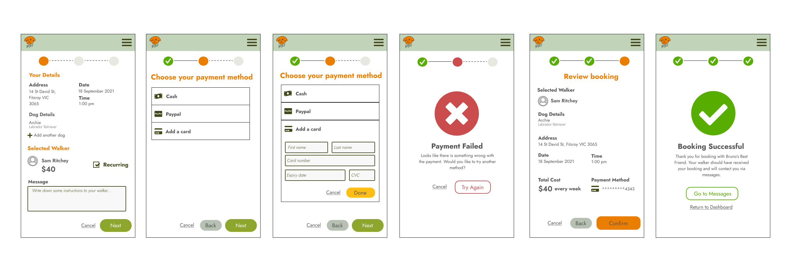
The UX team also provided personas. Both personas have different preferences in payment methods, paying in person and paying online. So when considering the flow of the payment method. It was important to acknowledge the types of options that users can choose to pay and its process. Both online methods, paypal and card, should have a payment failed screen available when the payment hasn’t gone through. Whereas, cash would lead to a successful booking, as it’s assumed that they’ll pay in person.
According to an insight from the user testing, participants also mentioned the inability to search for a query in the help page. So to fulfill that, a search bar should be considered when designing that page.
Component Library
After knowing the flow of the designs, I then needed to create a component library where it’ll be used throughout the application. The font that I have chosen is a san-serif, Google font named “Joist”. I found it a great typography, due to its simple yet modern feel.

Originally I had used the colour palette from the moodboard. But due to its limited shades, I found it difficult to design items from the background to the foreground. In addition, there were some issues with accessibility, for this reason, I needed to change the colour palette. For the pages to be consistent and concise, each colour that was added had some meaning behind it. For example, I had carefully assigned a colour with each type of button. Orange was for any confirmation clicks, like final bookings. Yellow was for any user action that could lead to the confirmation page, like finding a walker or viewing a profile. Green was for any pages where there is another page afterwards.

The icons used were from “Font Awesome”, which is a free icon toolkit with many commonly used icons across the internet. The icons are simple and readable, especially at small sizes.
I also designed a logo that was unique to the company’s brand, and to keep use of the brand, I created a loading animation that could be used when encountering a loading state.
During the design process, due to some circumstances and observation, I found that I needed to constantly change and expand my component library. There were a number of reasons. It could be due to the user flow or there were some usability issues. But overall, these components are made up into atoms and molecules and into the application that it is now.
Iterations: Page Designs
Wireframes to Mid-Fidelity
To begin my mid-fidelity designs, I utilized the wireframes provided by the other UX designers. In order for my design to stay consistent throughout the pages. I measured my pages into grids. For mobile, it is set to have 4 columns, tablets with 6 columns, while desktop with 12 columns. The use of grids is beneficial with keeping the layout tidy and organised.
The conversion from wireframes to mid-fidelity are quite similar to each other with just a few adjustments. These changes were based on the user testing where participants noticed the inability to browse the dog walkers in their area on the landing page. Consequently, a “Browse All” link was included for them to see all available walkers in the area.
In the mobile view, the map is hidden through a link as this is most likely an optional browsing method in finding a walker. Ratings were also added in each walker since users wanted to review them.
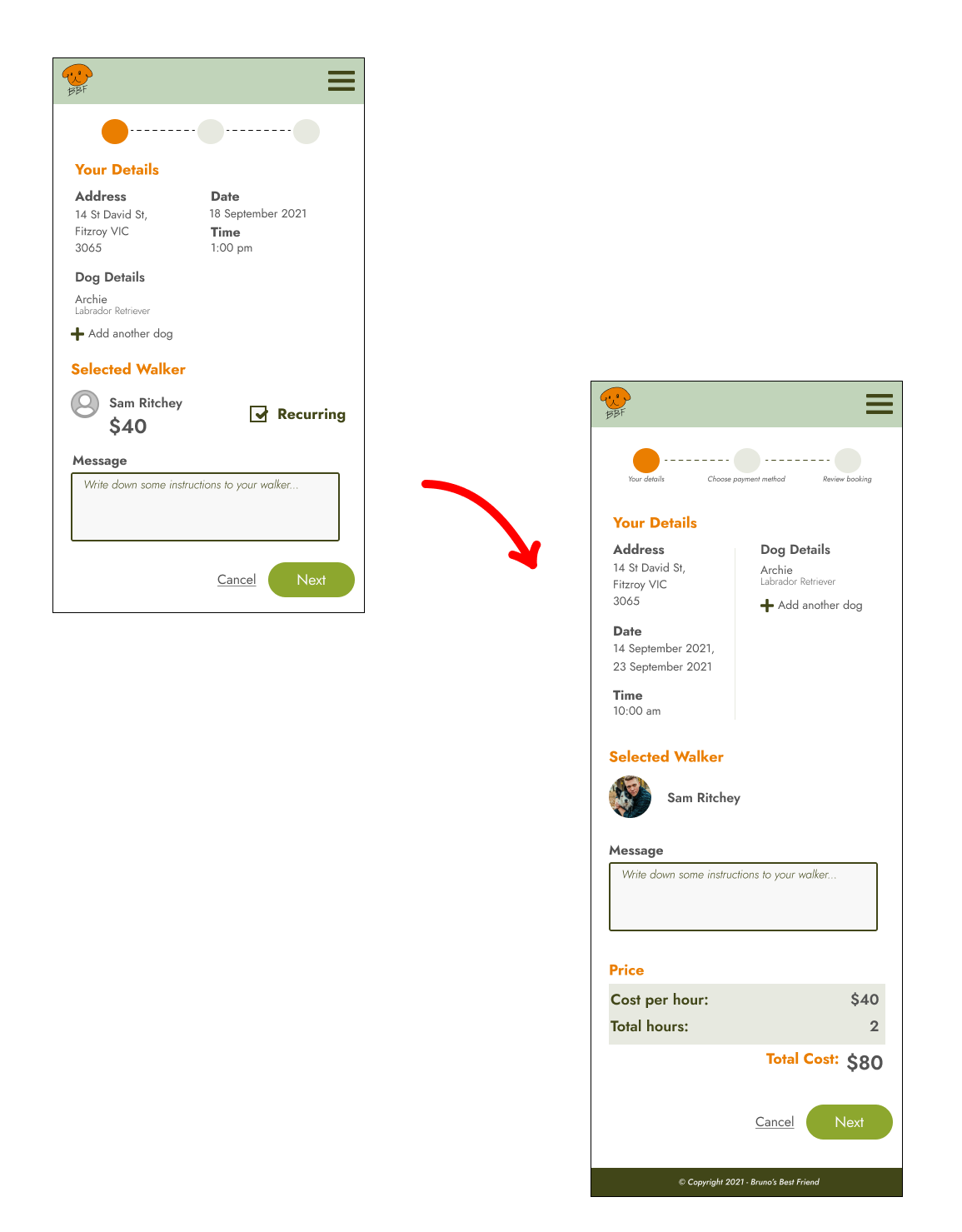
Staying consistent is key for my design, so all the buttons needed to stay at the bottom right because this is where users tend to reach for that zone more naturally. When users are booking, I like the idea of incorporating a status bar because this way they can know their current state in the forms.
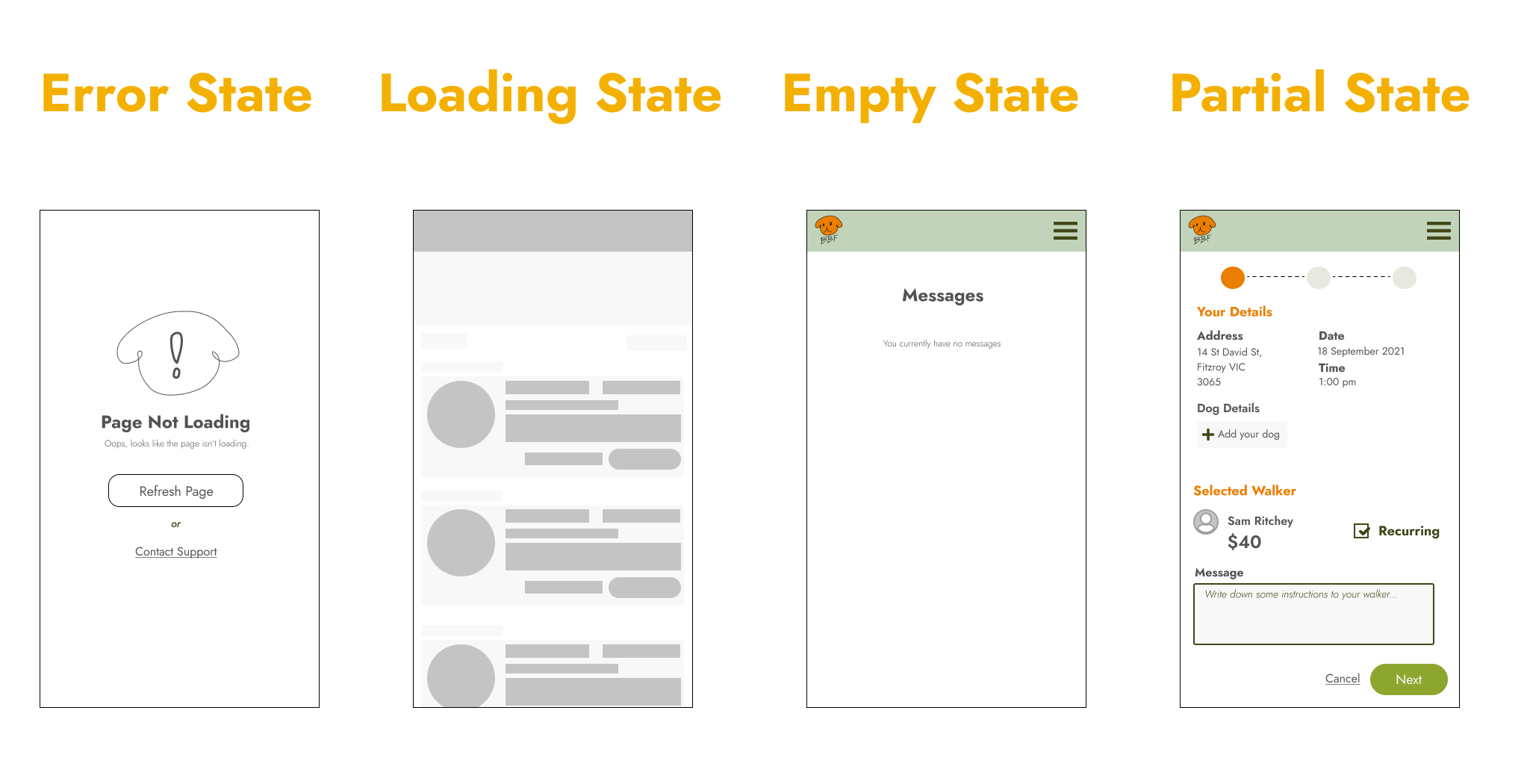
While designing the pages, the states were also considered.
Mid-Fidelity to High-Fidelity
After completing my mid-fidelity, I began evaluating my design. Was this enough? How can I make my design better? Is this going to meet the client’s standards?
As a result, I made a few changes.
Landing Page
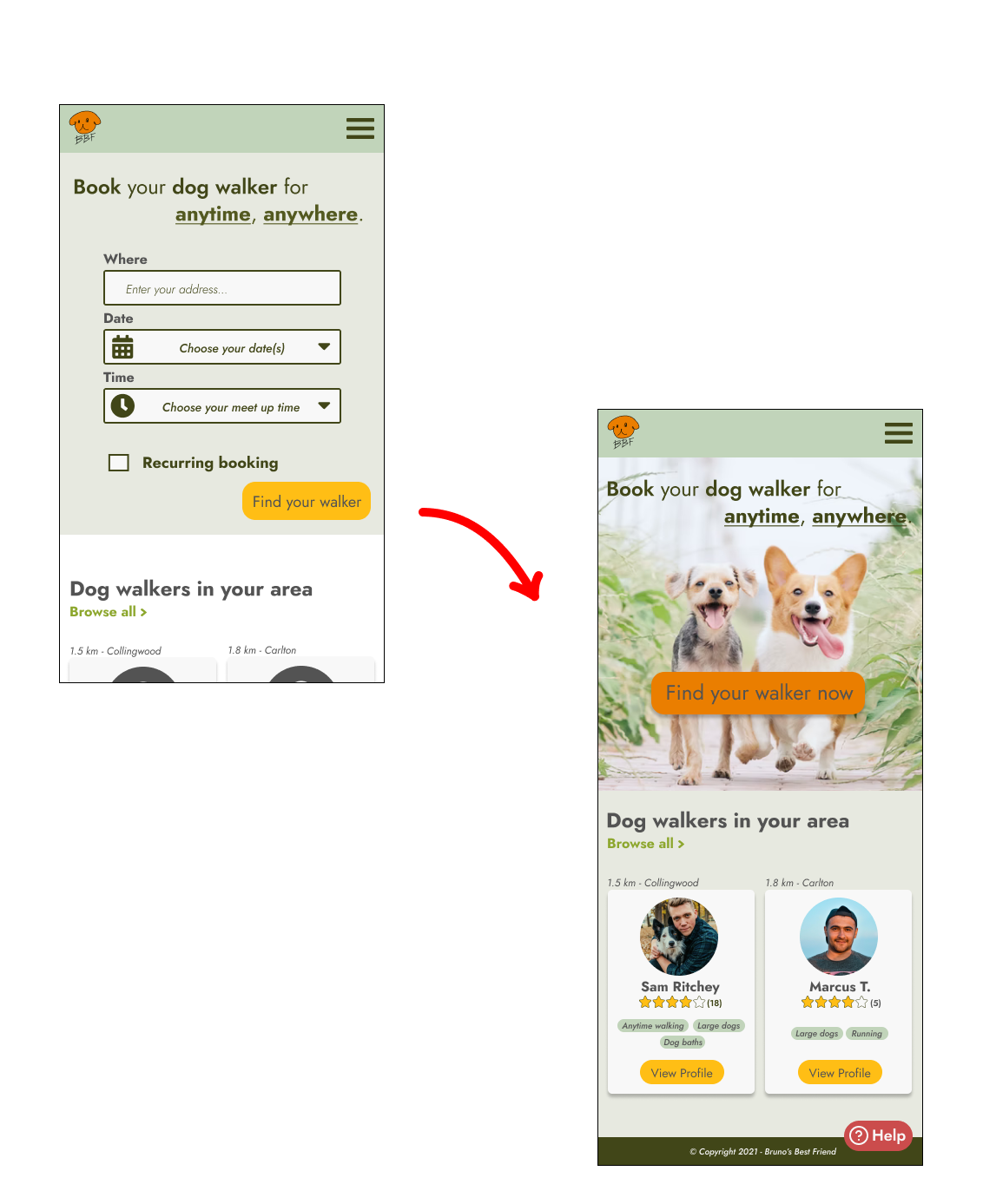
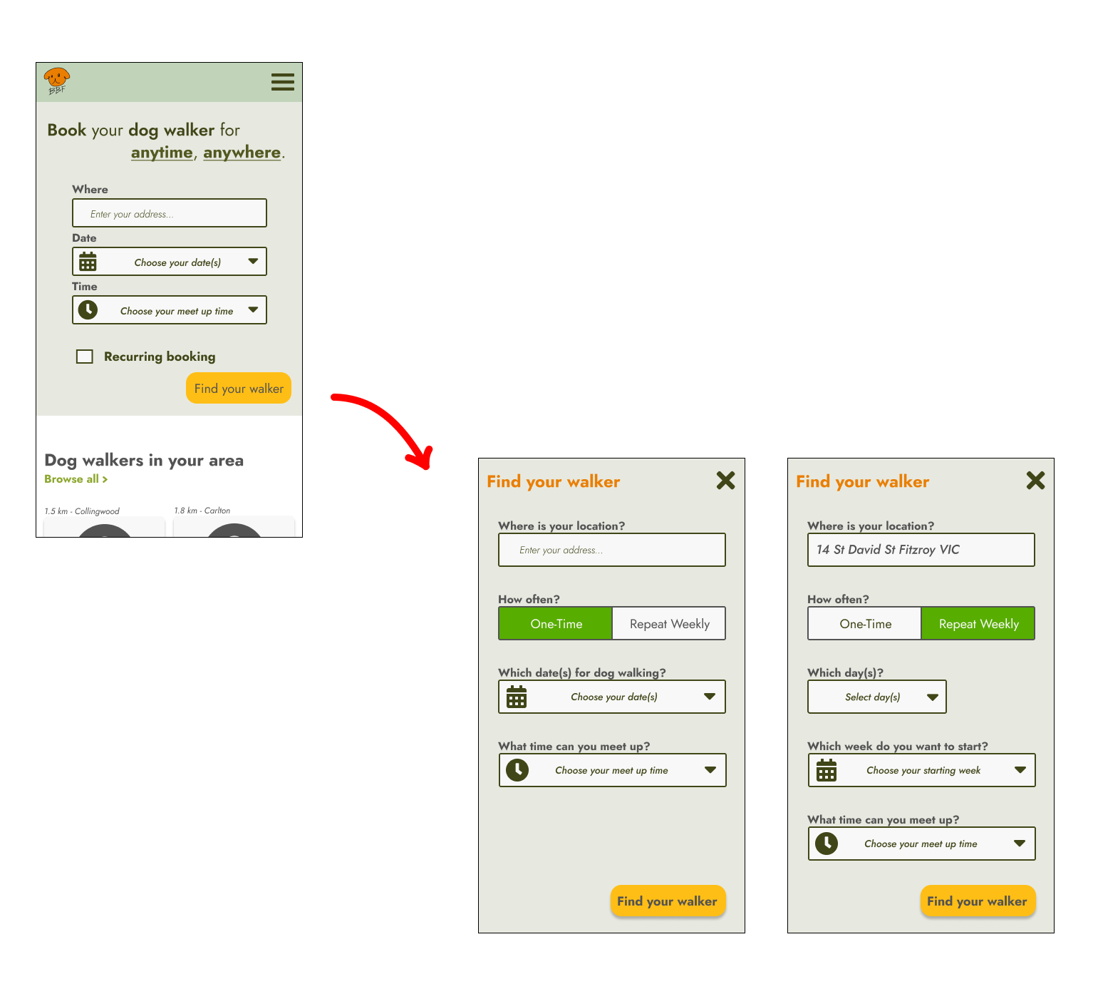
Previously my landing page had issues with the size of the inputs. With small screens it can be very hard to see and click. I felt that the information for the booking form could be separated into another page, where the user can follow all the booking information more clearly. Thus, I added a “Find your walker” instead of a form. I also added a fixed help button on the landing page, as well as some other pages, so users can access help automatically when needed.
Recurring Booking
Another reason for the changes in the landing page was the inclusion of adding a separate form for recurring booking. In my mid-fidelity, users needed to tick a box if they wanted a recurring booking. From a logical standpoint, it was unclear to determine how long the recursion was and which days they wanted it to be through a tickbox. To solve this problem, I altered the form so users have an option to choose a one-time booking or weekly.
The text boxes are also larger and labels are asking the right questions rather than having an ambiguous word leaving users confused. Applying gestalt’s proximity, the labels are more close together with the input fields displaying their close relation to each other.
List of Walkers
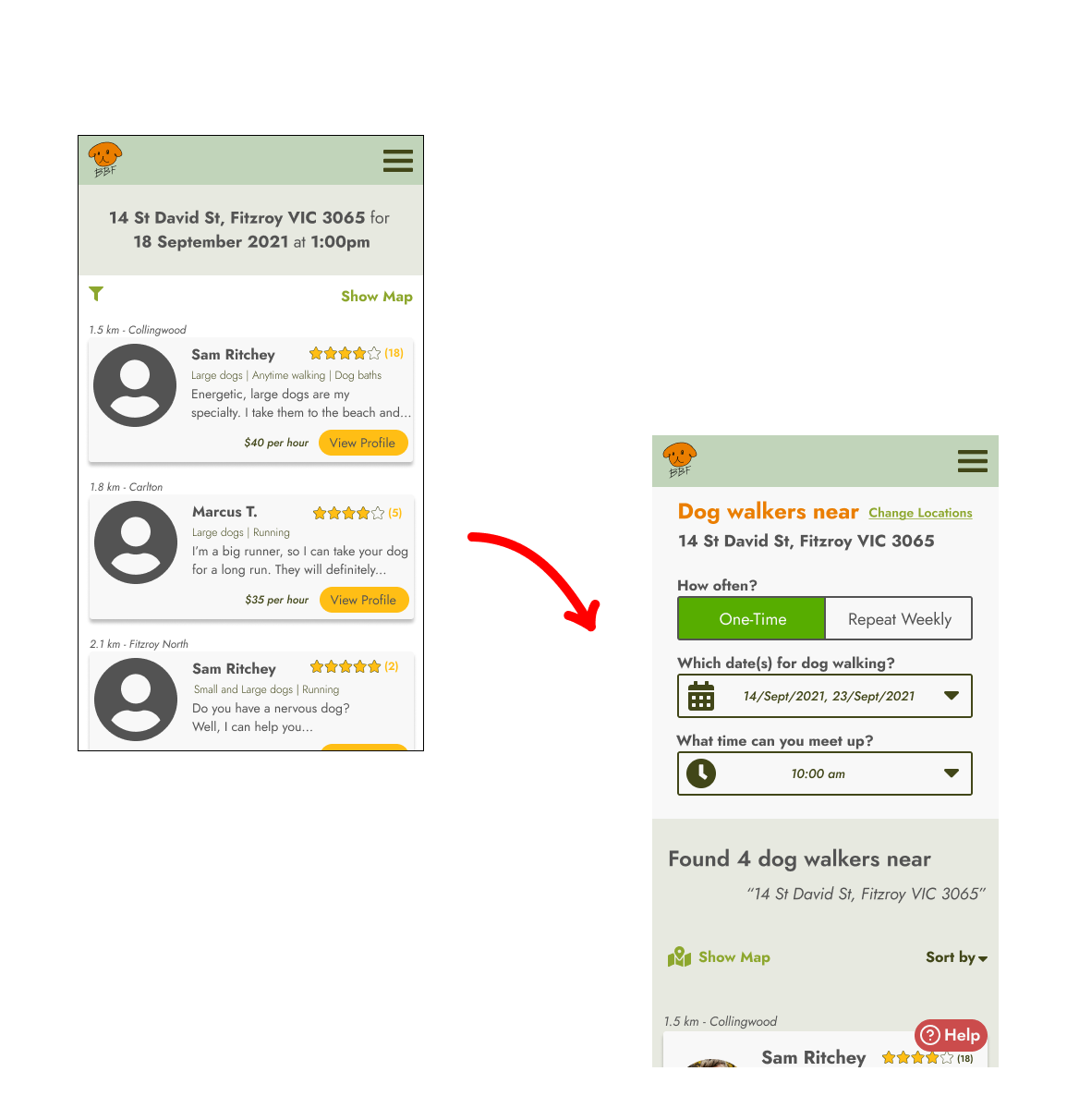
Due to the changes for the booking form, the user’s inputs are laid out onto the list of walkers page. In case users have a change of mind, modifying their request should be easier for them on the spot.
Booking Form
Although the status bar was a great idea, it still lacked information on the current and future state of the form. Having a caption underneath each progress would definitely help users identify the upcoming stage. Segregating the “Your detail” section with a line can also help users see the connections of the common regions.
Payment Method
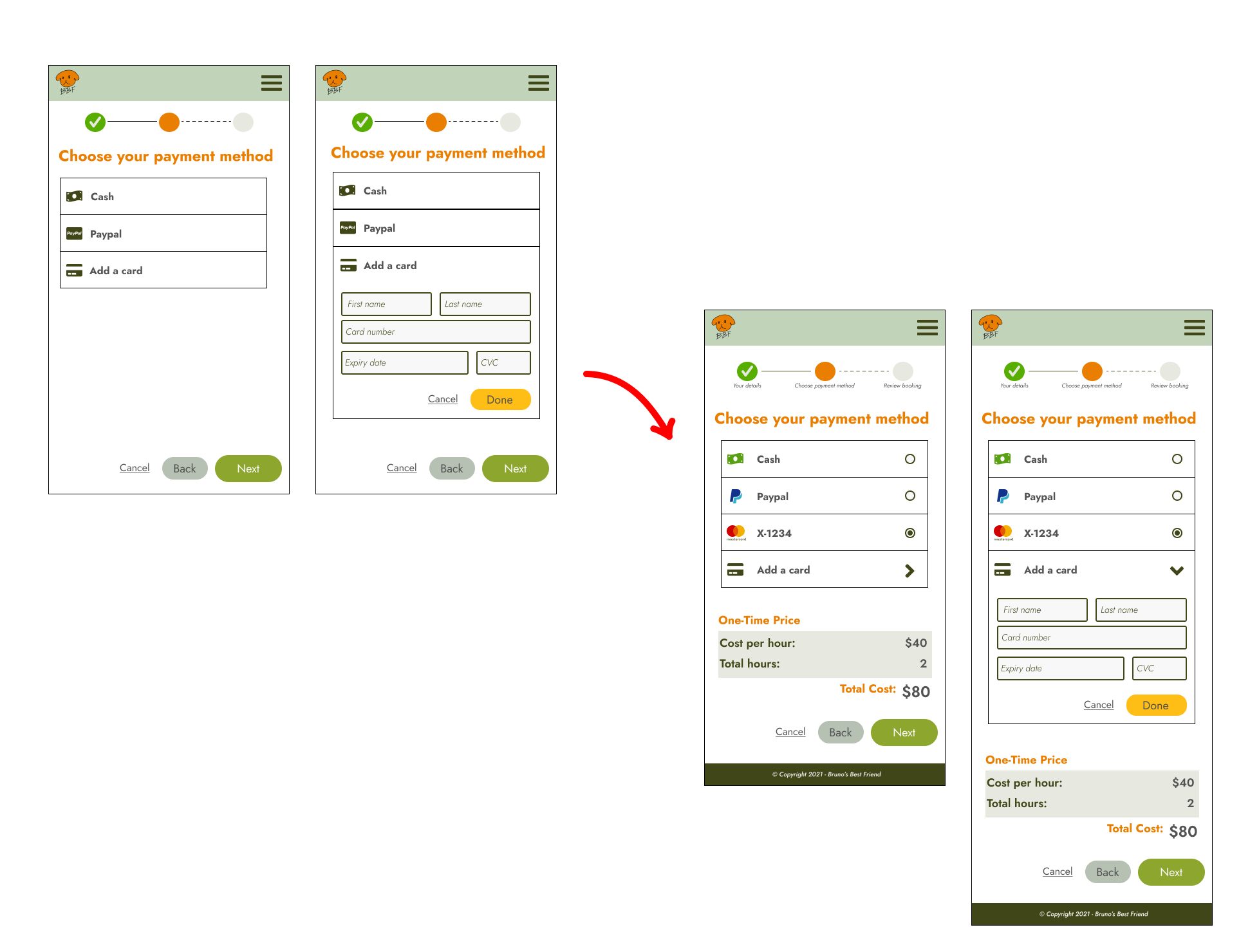
For the payments page, there were some notable issues. Firstly, there is no information on how much was being paid. Secondly, there is no indicator on how to select the payments. Judging my mid-fidelity, it felt like clicking on a payment method would open up another page. Adding radio buttons, on the other hand, can indicate that these are options. I also added the price so users know what they are paying.
Dashboard
Originally I thought of giving the user a dashboard where they are able to access the booking form again. But due to the changes of having a separate page for bookings, I felt it was better to remove it entirely. In the navigation menu bar, instead of having a link that goes to the dashboard, they should be redirected to the booking form page.
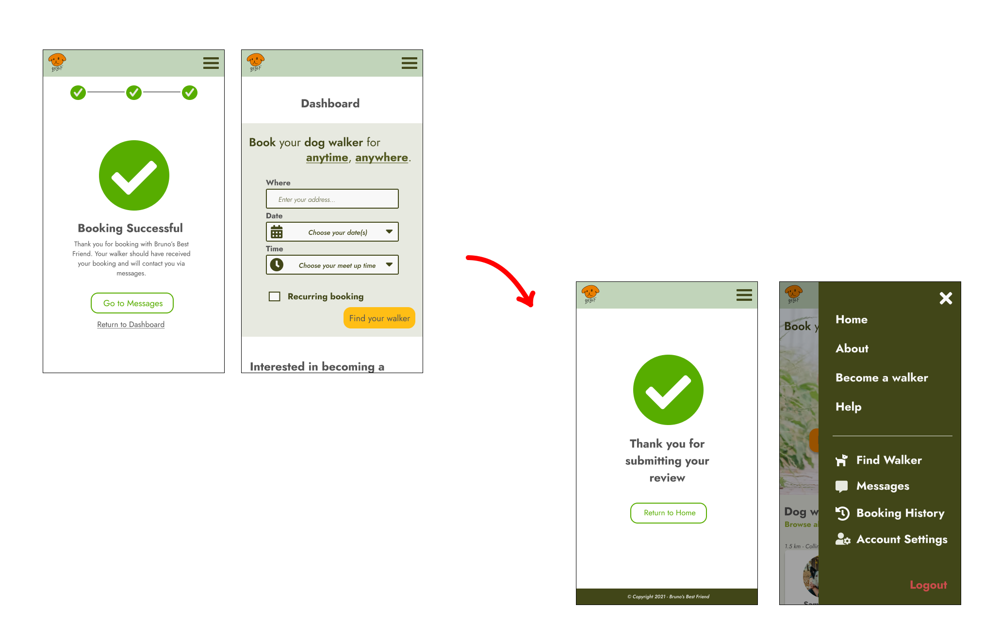
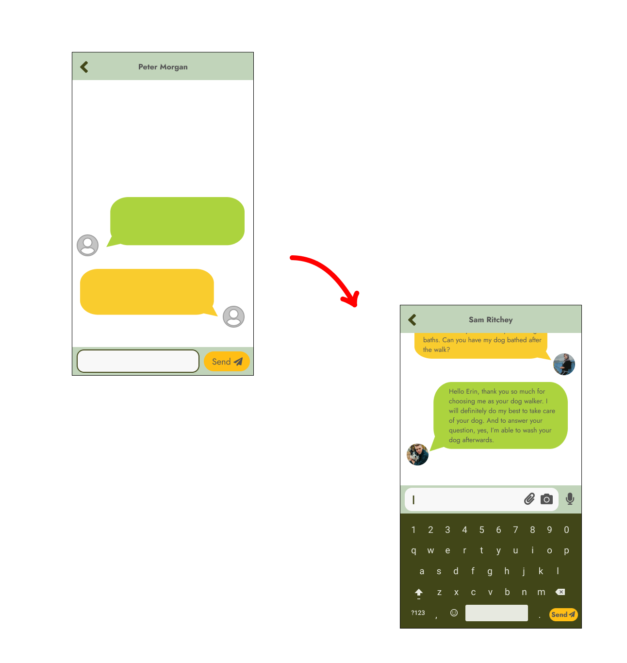
Message Walkers
In most messaging apps, there are options for users to speak on the chat, attach files or upload images. Since Bruno’s Best Friend has a messaging feature, adding these options would definitely enhance the user's experience.
Usability Testing
With these changes, I needed to test whether my design is usable. My goal for this testing was to see if my design functioned properly as I had expected, and if there were any issues that I had overseen. This usability testing took place through Zoom.
During my testing, there were some insights that needed to be addressed.
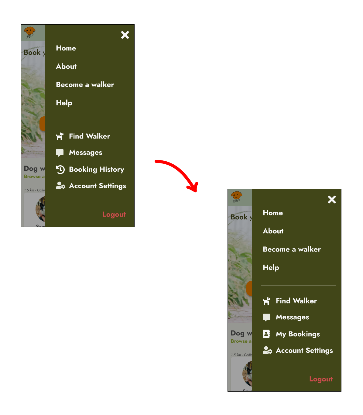
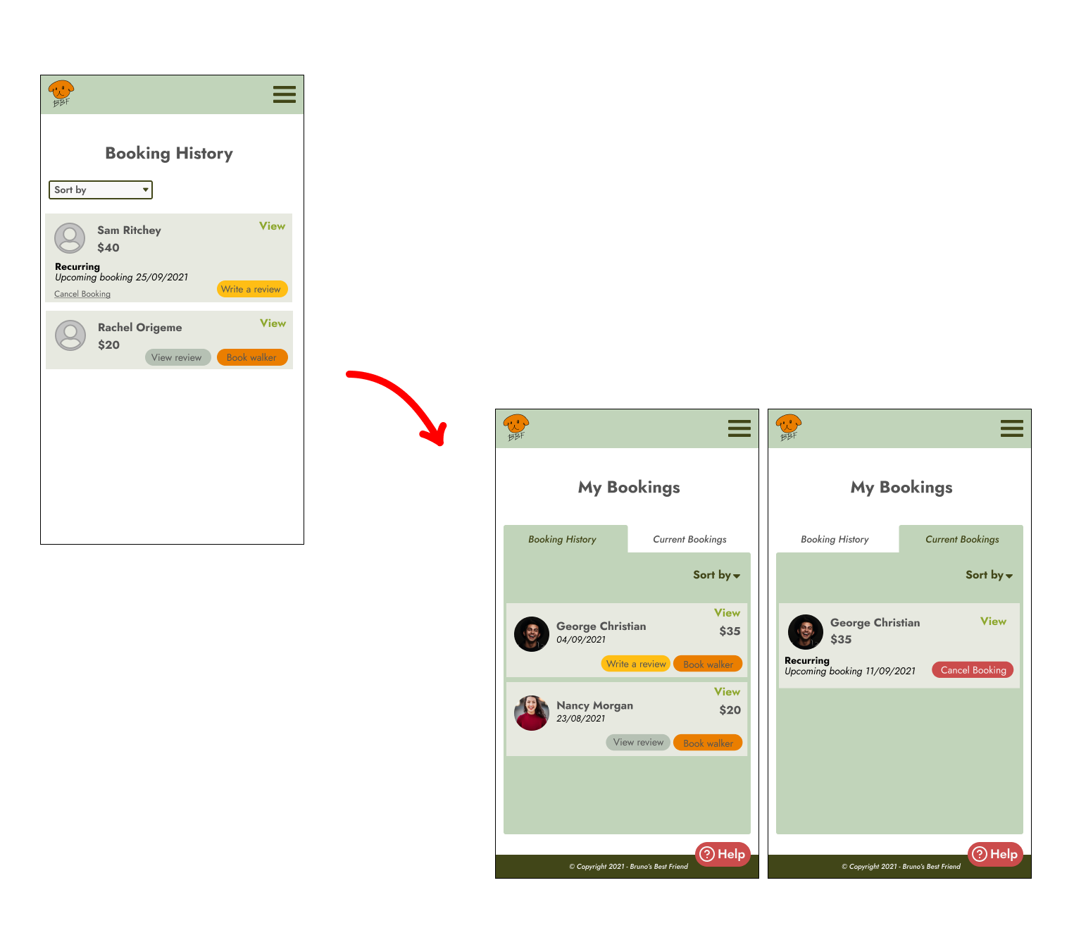
Insight #1
Some users weren’t able to figure out how to cancel the recurring booking. Despite having a “Booking History” on the navigation menu, the cancellation button for the recurring booking cannot be found in that area.
Solution
To specify the category more clearly, I changed “Booking History” to “My Bookings”, where all information regarding the bookings will be in that area.
With the navigation menu changed, this also meant changes in the page. I separated the current and past bookings and due to the fact that users cannot see the “Cancel Booking” link, the link is now converted to a red button to indicate that this is for cancellation purposes.
Insight #2
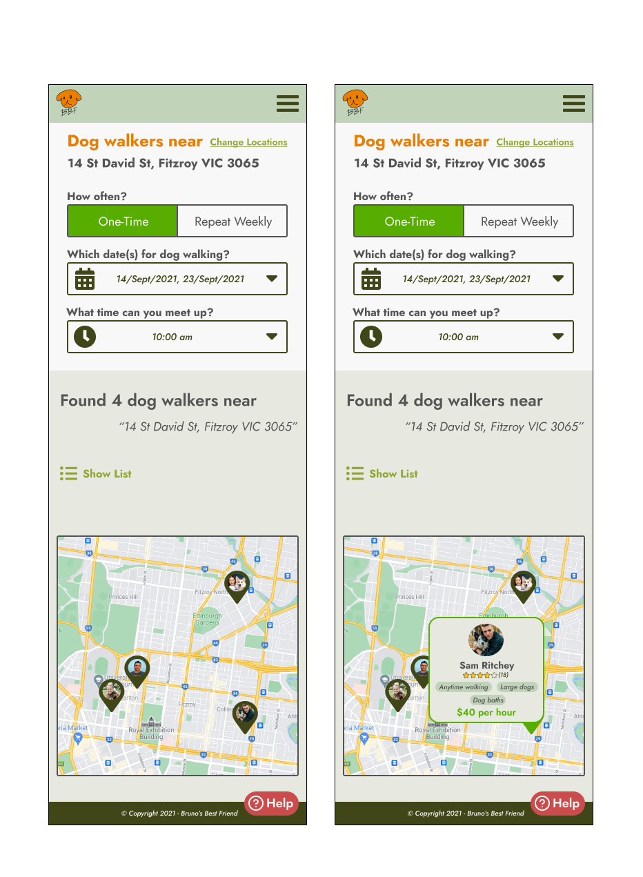
Another insight was the inability to navigate directly to the walker’s profile on the map. Since the map was an alternative way to browse through the walkers, being able to click on them was required. Users had mentioned that it was a bit annoying to navigate back to the list of walkers and find them again.
Solution
This was changed so that users can click on the walker and go to their profile straight away.
Outcome
Overall the design has met the company’s goals in feeling fresh and inviting. Dog owners should have the ability to book a walking session despite their busy schedule and have full control of their bookings.
Final Prototype made in Figma
Reflection
Moving from UX to UI
Throughout this process I have learnt the importance of achieving consistency in UI, and ensuring that the design is reflective to the requirements highlighted by the UX team. It is also important to consider the other states of the design, as this can give the user a better experience if the ideal state does not comply. I have learnt a lot through this course, and I’m very thankful to have this opportunity to expand my knowledge on UX and UI.
Other Case Studies